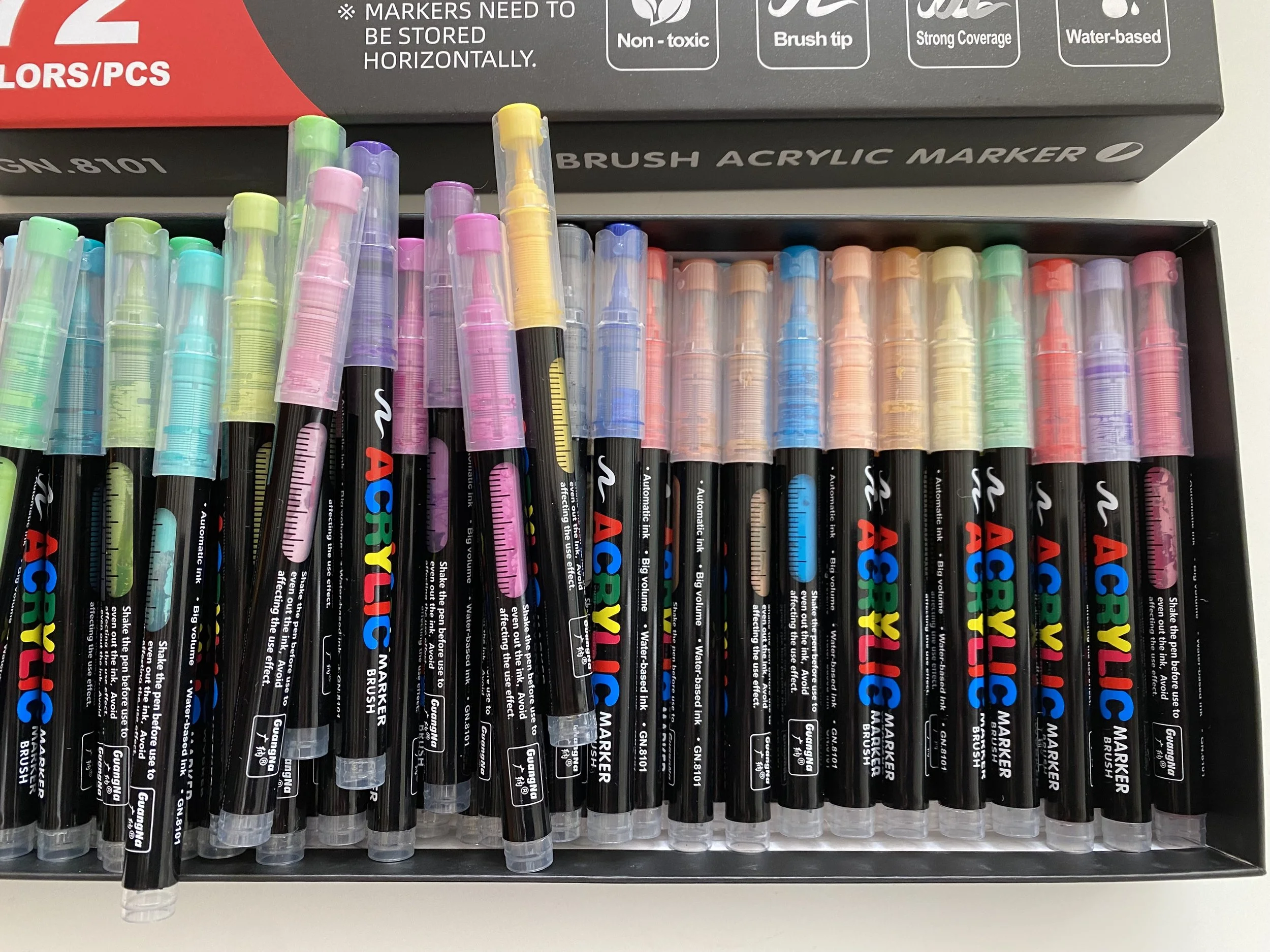
I have been enjoying using acrylic brush markers for mark making on acrylic paintings and mixed media artworks. In this video I explain their benefits.
Hello hello
Perth has had the wettest winter in nearly 30 years which is excellent for our dams so we're not complaining... much. It has made indoor activities very inviting though. However, despite that I haven't done a lot of painting this month. My creative energy seems to have been channelled into preparing lessons and then teaching my Colour Play abstracts painting course. We have just one more lesson to go and it has been loads of fun. It's such a joy to watch everyone's skills develop along the way. I have shared some photos further on of my students works in progress.
While teaching the course I have gone back to looking at colour charts. Not the kind you look at for painting the house but the kind you make out of the paint colours you have. It has reminded me the benefits of looking at the delicious colours you can create by colour mixing. I have shared…
Hello again
This is a shorter monthly newsletter because I have been away for half of July in hot, humid and beautiful Sri Lanka. While we saw some really quirky art, plenty of traditional art and lots of arty inspiration, I didn't create much art during the tour because it was quite busy. Hopefully I'll make up for that over the next month or so.
This newsletter I share some sights and sounds from Sri Lanka with you. I also have some questions to ask you in preparation for an art project I am working on for 2026. And, there is a little piece on…
Happy late June
Right now it's glorious sunshine and yet just a week ago it was howling winds and bucketing rain. I guess that's winter for you! Regardless, I love winter. Yep, I'm a bit weird I know, but there you have it.
We're gearing up for a 16 day Sri Lankan adventure in a week. I have been trying to complete a couple of things and do preparations for my two art courses coming up in August. I have made videos to promote both the courses which I share in the links further on (scroll down when you open the links). They are short snappy ones which give a taste of what the students will be doing during the time with me. What fun!
I have finished a painting of a gorgeous country road, and,
Hello again
I adore this time of year in Perth because we often have wonderful sunny autumn weather for days on end. If we are lucky there are a few days of rain every now and then as well. That's before the real wintery weather sets in around July.
I have some news from the studio for you this month. The most exciting is I am introducing my new trainee studio supervisor to you all, Shima.
Speaking of new arrivals, I have just finished a commission for a welcome baby painting. I will show you that one next month after the new parents have been gifted the painting by my client. I love creating these little paintings for the new baby's nursery.
Further on I share with you the finished cherry blossom painting I showed the beginnings of last month, and also several new digital paintings. And, my art courses are coming up in August.
Hello there
Apologies for not sending a newsletter in March. We were in Singapore and Japan enjoying a truly excellent holiday. Further on I share with you some visual delights from the trip - where do I start!
I didn't take sketching supplies on the trip, just my iPad. However, I confess I went to an amazing (and overwhelming) art supplies shop in Tokyo and bought a few bits and pieces. Imagine walking into seven floors of art supplies.... what bliss!
I did some Procreate painting on the iPad of stunning flowers we saw…
Hello
I have some news for you this month. Later in the year I will be teaching two different art courses. You can read about them further on. On the painting side of things I have been working on some very cute baby birth paintings for new babies that have come into the world. What a fun project.
It is the very last days of my Fab Feb sale too so you still have time to make the most of this before February ends. Think Mother's Day and other gift giving times coming up for you.
Hello again
I love starting a new year because for me the new year feels all shiny and full of promise. I hope your 2025 brings all you wish for.
My studio work has been off to a slow start this year due to a longer break in Sydney than usual over the festive season, followed by…